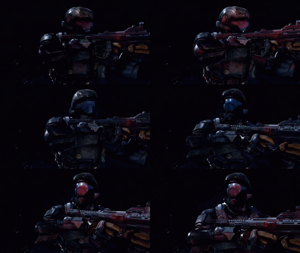
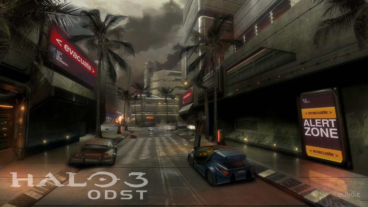
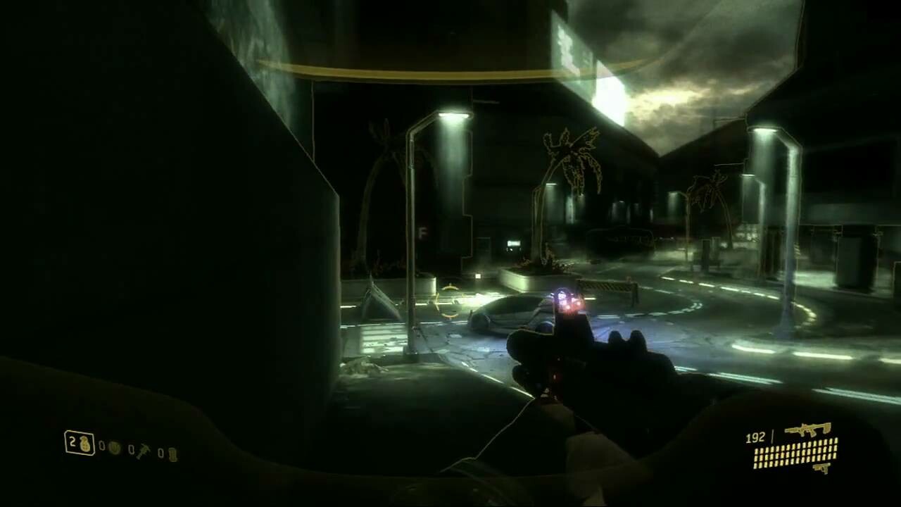
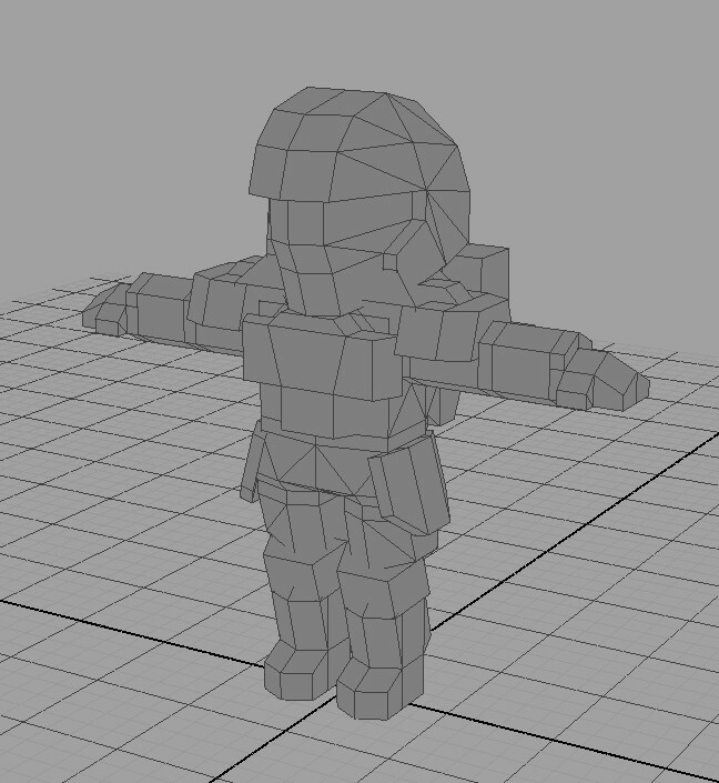
"What if I shifted to an ODST ‘training’ battle-royale-ish theme for the Halo project? Persistent multiplayer set in a big city map, day / weather cycles, new players can DROP in mid-game, squads and emotes, grind your rank until you promote into a Spartan... hhhmmMMM 🤔"
After a fair bit of thought regarding scope (both of art and gameplay), I'm thinking about adjusting the end design of the Halo project somewhat. Certain features I've already decided on such as multiplayer, customisation, and a single map are sticking around but specific changes to art level of detail and the environment itself are going to be required in order to scope back the project I think (for a multitude of reasons). Thankfully though aside from pulling certain gameplay elements (sprint, specific weapons etc.), most code and mechanics require no changes from what exists in the prototype already. Hooray!
Multiplayer
Originally I was going for very vanilla Halo 4-based experience with your typical Slayer game type on a big open map. Would likely have had a simple server browser / auto matchmaking that you could join games with. Going with the ODST-themed route, it would be cool to adjust the game towards a more 'persistent' and almost community-based gameplay experience. My initial thoughts were multiplayer matches that never end, where players can drop in and grind for kills as they wish and then can just extract out whenever they're done. Play as a squad or in FFA and just have fun shooting up opponents, going for achievement / collectible goals, or just messing around and doing whatever. Technically it's not that different from what I originally planned so there's no huge sacrifice going for this style of matchmaking. Plus the main draw was being able to see players LITERALLY drop in to active games in ODST drop pods. So cool.
The key thing to remember is that as a lone developer I really don't have the resources and time necessary to really push for full-scale Halo multiplayer, so changing to gameplay where the player chooses their objective and fun lifts some of that responsibility. I just have to provide the sandbox.
Customisation
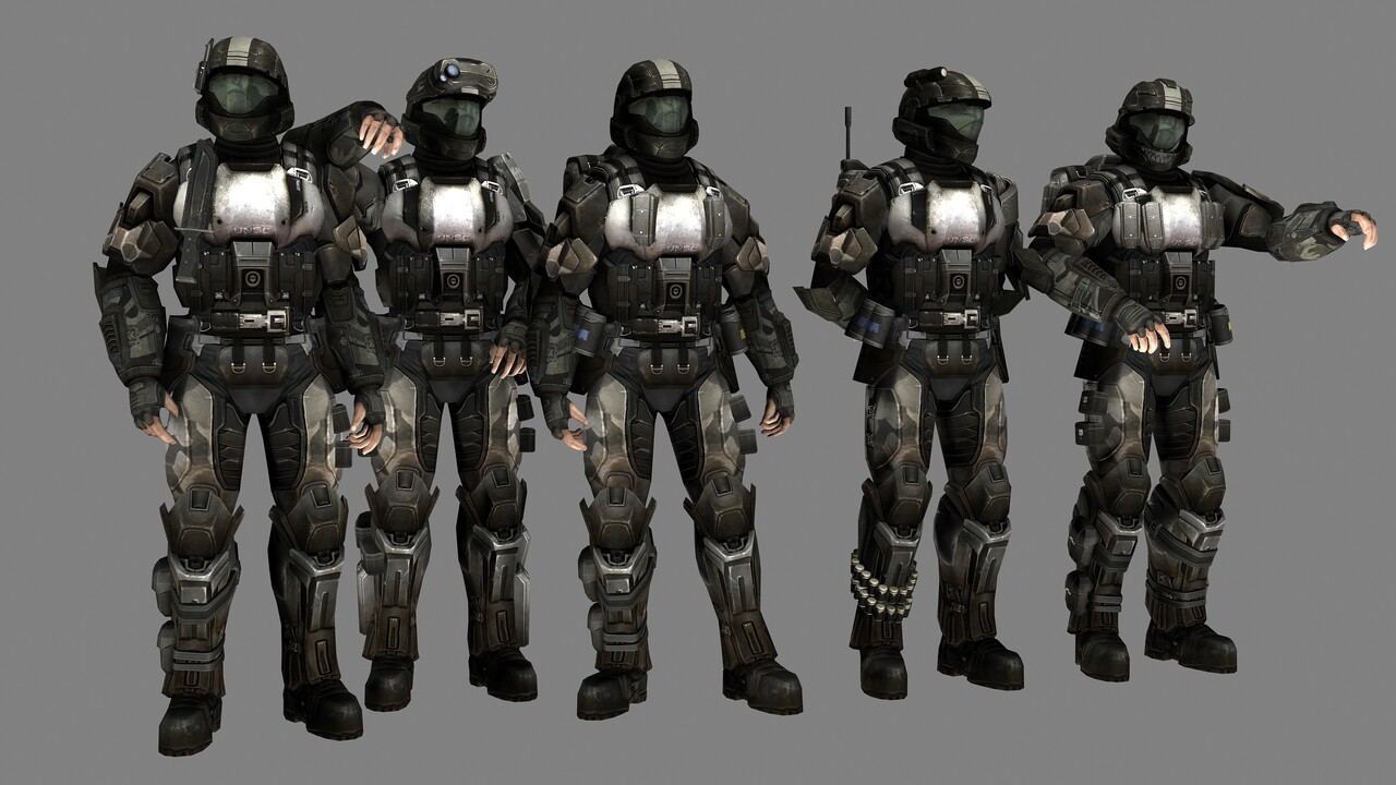
In order to allow players to change their Spartan's appearance in the original prototype I would have had to model entire new armour sets, which is incredibly time consuming. ODSTs however are outfitted with more 'stock-standard' military gear and as such their customisation options tend to lean more towards additive props on top of their default armour (think pouches, helmet add-ons, extra ammo magazines, knives etc.), rather than total armour makeovers.
Props are smaller and thus quicker to make > more props can be made > greater number of potential combinations players can choose from > easy to add in an actually decent progression system with varied rewards. Add the typical colour choice for your armour + some fancy visor colour stuff and there's a lot of potential for cool looking ODSTs with very minimal work on my behalf.
https://www.deviantart.com/advancedspartan/art/Halo-3-ODST-Gang-160555948
Single Map (+ other art changes)
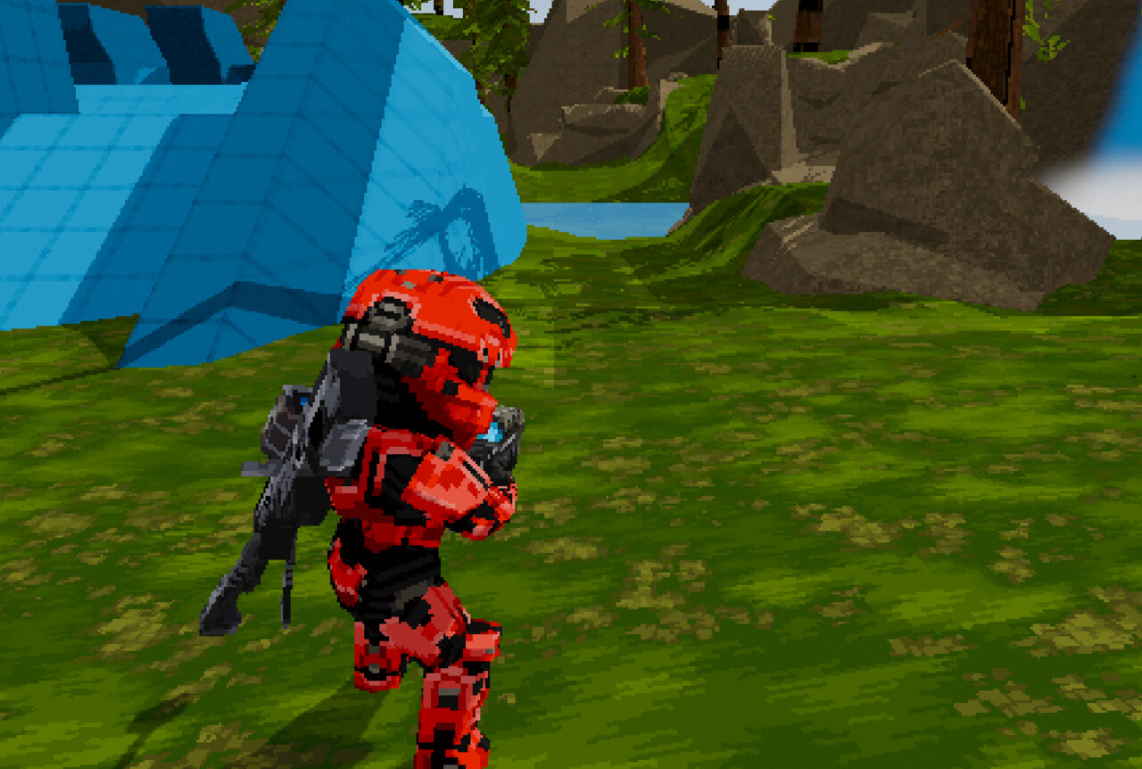
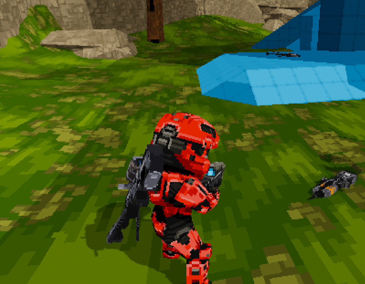
The original Ragnarok-styled map from H4 was very natural and organic in terms of the assets required to put it together. Lots of bushes, trees and especially a lot of rocks and cliffs. Those last two were especially problematic for my pixel textures and it opened up a whole new issue for me and my art style. While the pixels on my Spartan texture were very visible up close, those same-scale textures applied to massive swathes of rock (and the ground for that matter) faded into complete noise from a distance. I had to half the size of my textures for the pixel aesthetic to even be noticeable (as opposed to just low-res noise). So there's a key learning there in regards to the actual proportion of pixels (and also model detail) that I need to shift towards. Simultaneously the sheer quantity of unique rock and other organic models that would have to be meticulously UV'd wasn't doing much for me. The thing about pixels is that they're very straight, and trying to conform them to a lot of curvy meshes is kinda a pain. THUS, we shall abandon this organic world and set forth into the brutalist, clean-cut realm of a man-made city!
Lowering the tiling amount brings the pixels back to forefront of the style and is closer to the visual identity I'm after
Since this is going to be one single map that has to support anywhere from 10 to 50 players (who knows), it's gonna have to be pretty big. The joy about cities and man-made stuff in general is that they're incredibly modular, meaning I can just craft a collection of blocks and pieces that connect together into buildings and roads etc. and then duplicate the absolute crap out of them until I have a big environment to play around in. I'm thinking of aiming for a very defined 'quadrant' themed map, with four primary combat areas and multiple pathways linking them together. Since players are gonna chill in this map for who knows how long, it's gonna be important to keep things interesting somehow. Emergent gameplay can come across with day / weather cycles that would affect visibility (opportunity for VISR mode action), sections of the map could be locked off to force players to meet each other, plus there's plenty of potential for hidden collectibles and more relaxed 'side-mission' objectives what with all the sprawling paths and routes that'll inevitably show up.
So, that's the gist of where the project's at right now! Honestly I kinda decided this a little while ago, and our ODST model is very near to completion already so stay tuned! Thanks for everyone's support on my little project so far too, it means a lot! Also props to you if you actually read all this - have a cookie 🍪🖤
